



Payout Failures List
Status
Pay Date
Failure Date
Vendor
Amount
Processor Type
Funding Ins.ID
Approved
04/13/23
04/13/23
Westham Golf Management LLC
$ 2,221.00
Vantiv 12.0
PID_3242090
Approved
04/13/23
04/11/23
Trump International Golf Club Scotland
$ 1.74
Stripe
EID_943773
Approved
03/28/23
03/28/23
Sterling Golf Management Inc
$ 36.77
Vantiv EMV
PID_3242090
Pending
03/27/23
03/28/23
Sterling Golf Management Inc
-$ 382.52
Vantiv EMV
PID_3183702
Pending
03/18/23
03/20/23
Sterling Golf Management Inc
-$ 922.85
Vantiv EMV
PID_3183713
Approved
03/11/23
03/13/23
Silverlake Golf Management Inc
$ 36.23
Vantiv EMV
PID_3242090
Approved
03/11/23
03/13/23
HC COMMISSIONERS OF ROADS AND REVENUE
$ 36.23
Vantiv EMV
PID_3242090
Approved
03/11/23
03/13/23
HC COMMISSIONERS OF ROADS AND REVENUE
$ 36.23
Vantiv EMV
PID_3242090
Approved
03/11/23
03/13/23
HC COMMISSIONERS OF ROADS AND REVENUE
$ 36.23
Vantiv EMV
PID_3242090
Approved
03/11/23
03/13/23
HC COMMISSIONERS OF ROADS AND REVENUE
$ 36.23
Vantiv EMV
PID_3242090
Approved
03/11/23
03/13/23
HC COMMISSIONERS OF ROADS AND REVENUE
$ 36.23
Vantiv EMV
PID_3242090
Approved
03/11/23
03/13/23
HC COMMISSIONERS OF ROADS AND REVENUE
$ 36.23
Vantiv EMV
PID_3242090
Rejected
03/11/23
03/13/23
Alliance GCP Management Services
$ 36.23
Vantiv EMV
PID_3242090

1
2
3


Reconcilliation: Payout Failures

Search within Green Golf Partners LLC...

Filters


Financial Dashboard


Dashboard

Vendor Principals

Reconciliation

Payout Failures
Chargebacks

Security

Onboarding

Admin

Terminals


Lexi Vodopija
Admin
GolfNOW Admin Portal
A Fintech experience
Project Overview
During my internship at NBC GolfNOW, I was given the opportunity to re-design an internal dashboard used by the financial team to manage clients and business transactions.

ROLE
Lead UI/UX Designer
UX Researcher
sole design owner
PLATFORM
Desktop
PERIOD
5 weeks (Research to
Final Design Presentation)
RESULT
Design Presentation
Design File Hand-off
My role during my 4-month internship at NBC Sports NEXT:
- Collaborate with the engineering team to fix UI issues in B2B portals
- Organize the design system for their D2C-facing applications
- Engage in UX discussions with the UX Director and his team
- Create Personas and educate the financial technology team
- Redesign the Admin Portal (from roadmapping to final designs)
- Present to the Head of UX of the internship achievements
AN OVERLOOKED PREMIUM
Danger zones behind the interface
A secure interface does most of its work quietly, filtering out room for error before users even notice it.
Used across the financial team—from categorizing client names to reviewing significant transactions—the everyday portal was making simple tasks feel complex and risky.
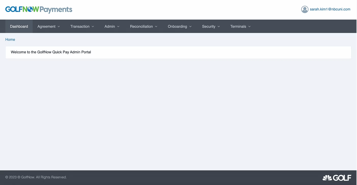
88% of the users responded the portal is “visually overwhelming”
UX RESEARCH
Not confusion - unmet expectations
I created a flowchart of the portal for organization and ran user interviews to learn about how the portal gets used.
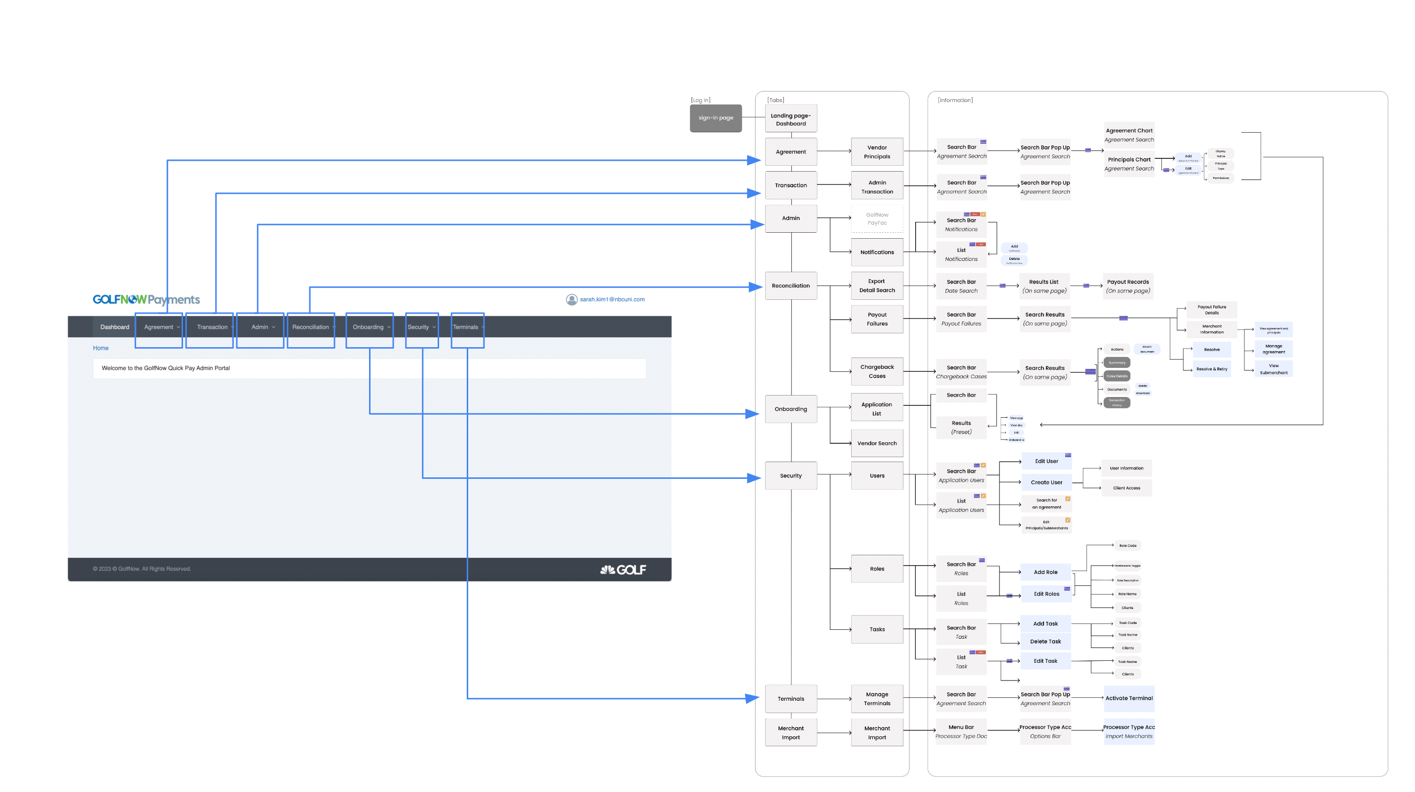
User interviews
I conducted four moderated user interviews across sub-teams. A consistent pattern emerged: users knew what to do, but the interface required them to navigate cautiously and repeatedly cross-check information.
The issue wasn’t comprehension—it was confidence. UI confusion created hesitation, slowing users down and prompting unnecessary double-checking.

“Yeah…We know how things work.
But the process takes too long and we are prone to make mistakes ”
. - Patrick (Chargebacks Team)
ITERATION
Rapid Prototyping
With a short time constraint, I rapid-prototyped and tested the flow and the visuals of the design variations with the team users. The process included paper sketches, low-fidelity wireframes to mid and high fidelity prototypes. I worked closely with my project manager to discuss thoughts and make quick changes and updates to the designs.
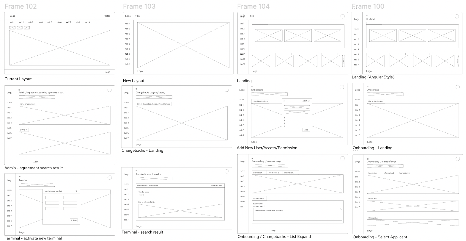
Low fidelity wireframes
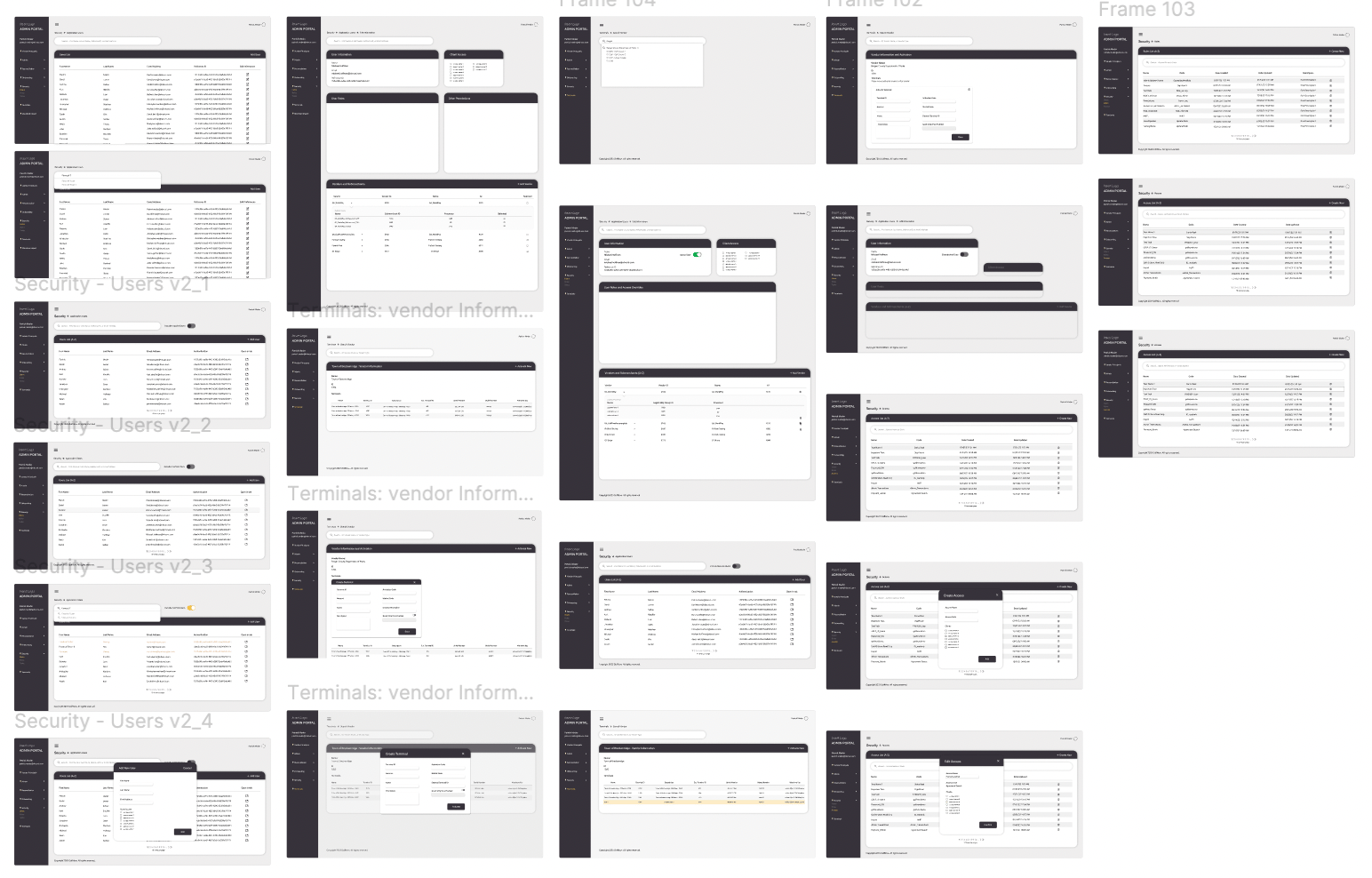
Mid-fidelity, black and white
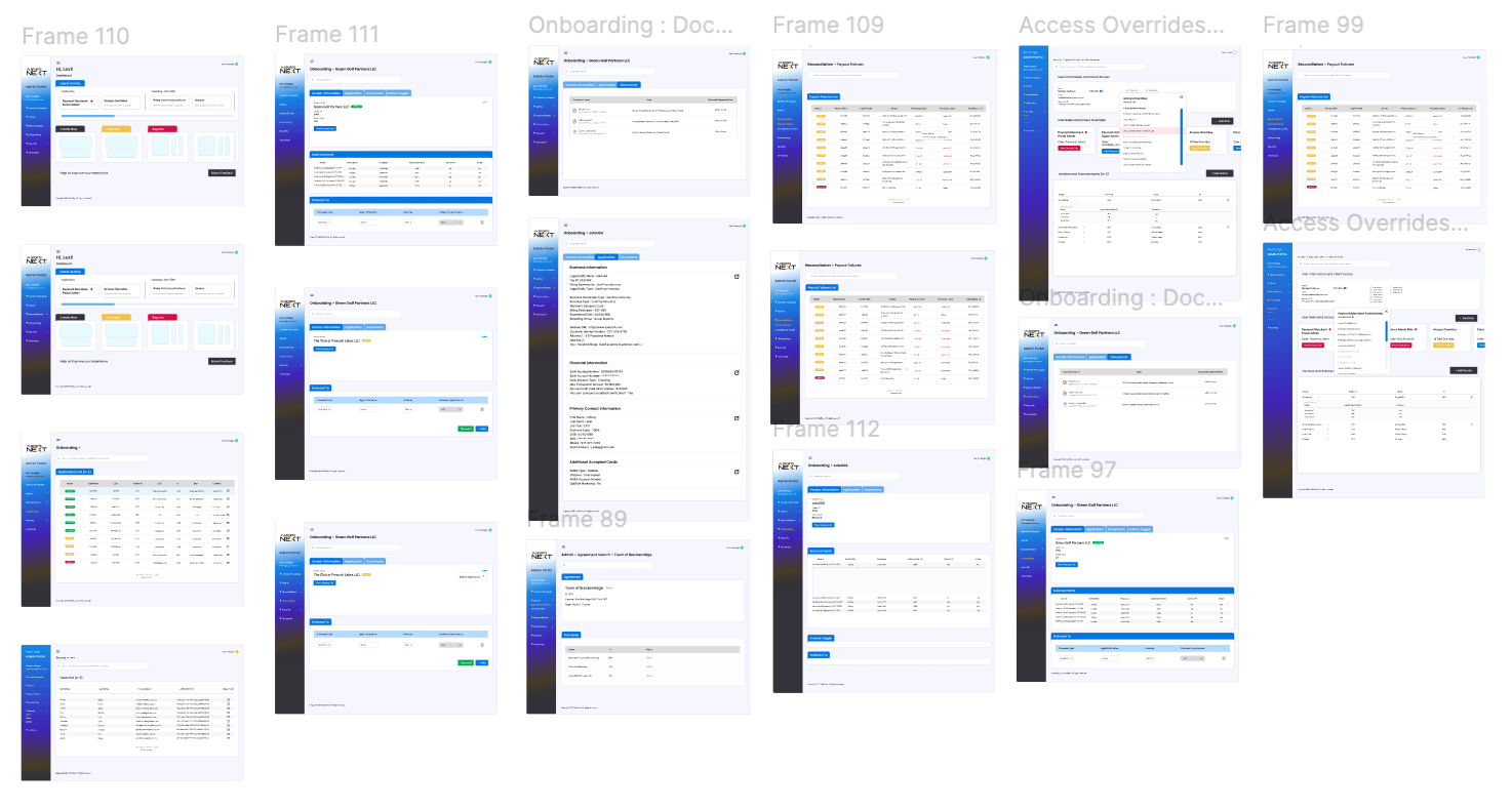
Version 1, Iterated, design system exploration
DESIGN SYSTEM
Seeking the right visual language
The final screens applied tested improvements within the existing design system to create a more usable and intuitive interface.
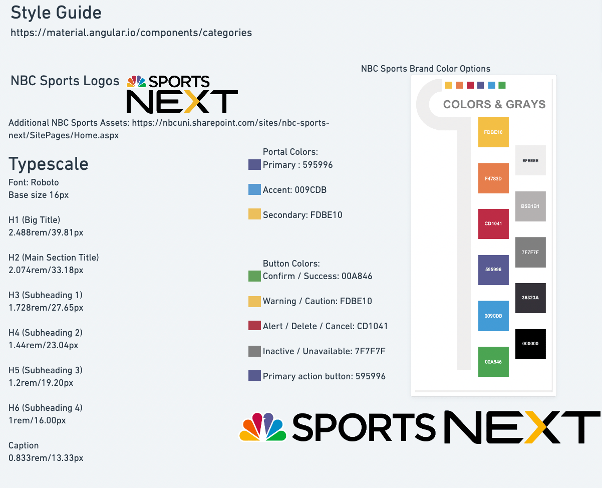
Preexisted Design System that was not fully being utilized in the old portal design
DESIGN DECISION
Make a Few Impactful Changes
Instead of completely recreating a new portal, I decided to remodel the existing one by applying some core UX design principles that I selected from its list. ‘Let’s build a User-Centric Design through maximizing Accessibility, Simplicity and Visual Hierarchy’
Decluttering and Safeguarding
The important buttons were tucked away inside each item from the list for safety measures. Therefore, each page would have consistent hierarchy of information which would further prevent mistakes of mis-clicking the wrong action button caused by human factors.
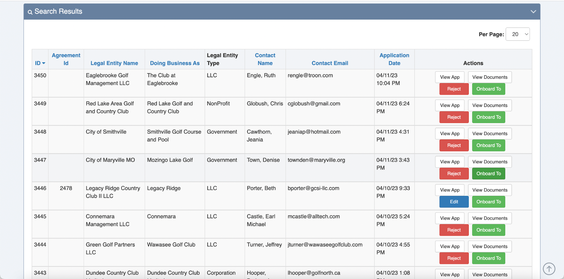
Application list (old)
Application list (new)
By adding interactive elements, I further cleaned the interface and created more breathing room to reduce the user’s cognitive load.
Item on the list responds to the user’s movement
Intuitive Reading
I utilized the design system colors to guide the user's eye using basic GUI elements, contrast, and spacing to highlight important actions and status labels.
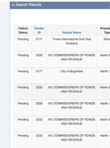
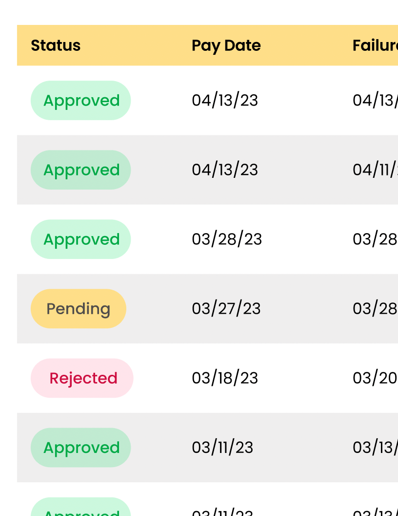
Old list design → Updated list design GUI


Vendor Information
Application
Documents
Feature Toggle
Vendor Name
Green Golf Partners
Onboarded

Vendor ID
3445
Vendor Type
LLC
View Access List
Submerchants
Name
Verification
Processor
Submerchant ID
Send to PP
Active
American Golf Corp TCZ EEZ
YES
Vantif EVV
6780
YES
Active
American Golf Corp TCZ EEZ
YES
Vantif EVV
6781
YES
Active
American Golf Corp TCZ EEZ
YES
Vantif EVV
6782
YES
Active
American Golf Corp TCZ EEZ
YES
Vantif EVV
6783
YES
Active
American Golf Corp TCZ EEZ
YES
Vantif EVV
6784
YES
Active
Onboard To
Processor Type
Legal Entity Name
Currency
Processor Type Account
World Pay

Name
USD
N/A


Onboarding: Green Golf Partners LLC

Search within Green Golf Partners LLC...

Filters


Financial Dashboard


Dashboard

Vendor Principals

Reconciliation


Security

Onboarding

Admin

Terminals


Lexi Vodopija
Admin
USABILITY TESTING & PRESENTATION
Thoughts About the Project
I created a usability test using a live prototype of the screens and had each of the team members complete the study in their own time.
All eight participants successfully completed the study without deviation. The greatest measure of success was their immediate response to the new interface— they found the navigation intuitive and easy to follow, even on their first attempt of the prototype.
At the end of my internship, I delivered a fully organized design file to my project manager. Although the work was created for the FinTech team, the GolfNOW D2C team also requested the file as a reference for future designs.
Working on a live application with thousands of pieces of information taught me how to navigate complexity without losing sight of critical user actions. Discovering previously undocumented pages along the way added an unexpected challenge, requiring me to continuously refine the user flow while preserving important information and functionality.
Given the scale of the project and limited timeline, defining clear goals and roadmapping the process became essential to bringing the project across the finish line.

Back to Projects